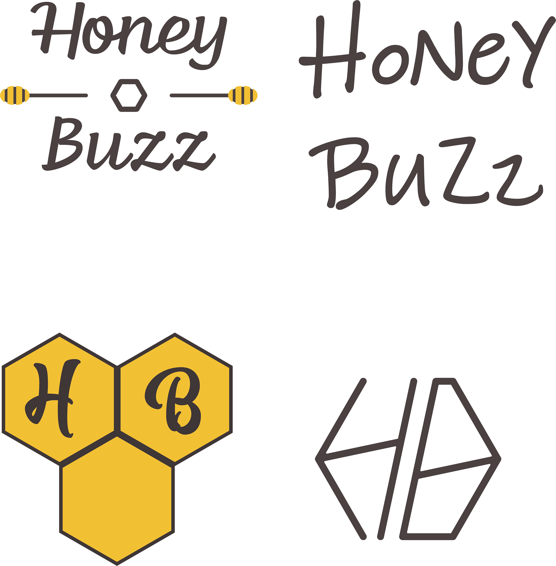
When doing the branding for this company I had made many logo drafts for the small company including the four above.
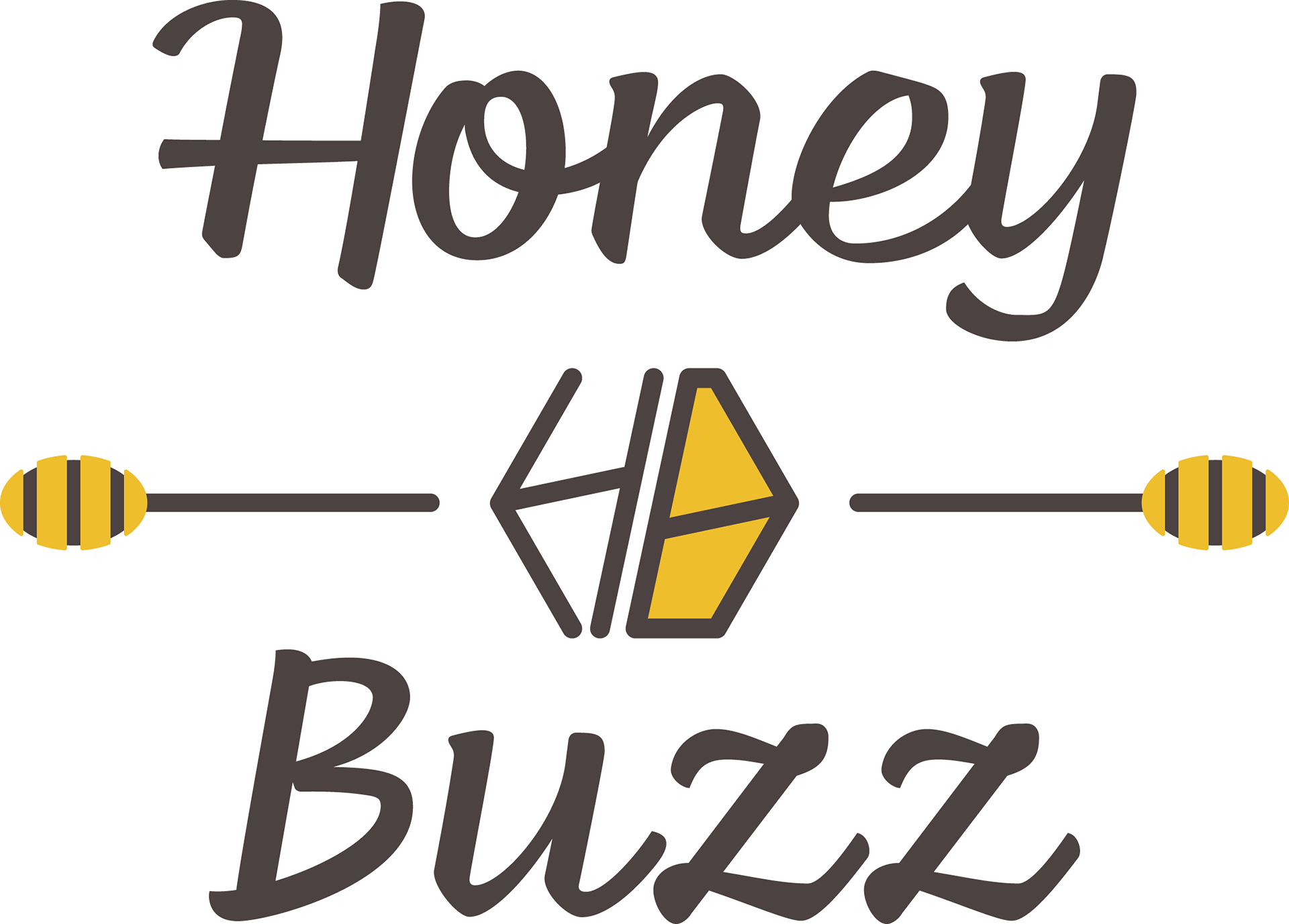
Ultimately the final logo would combined the first and fourth drafts of the logo. this would become the base everything else seen in the branding
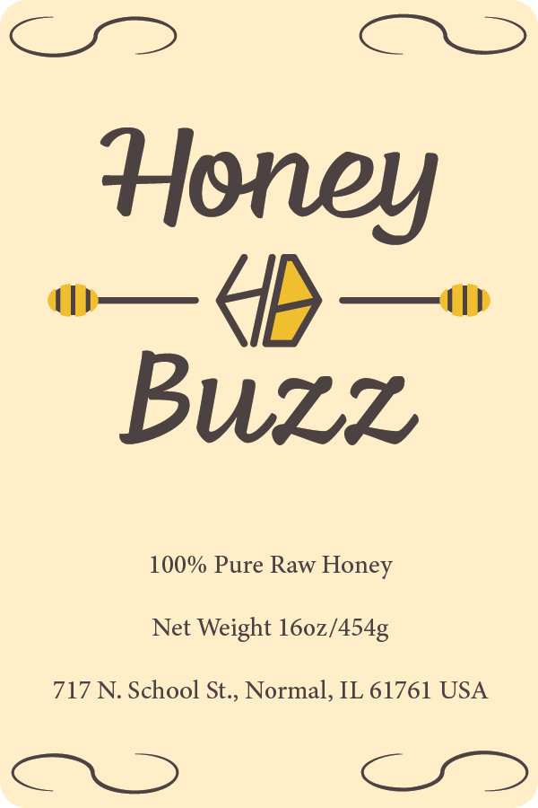
For the label, I decided that I would go with something simple yet elegant. the logo itself would be put on the top while the information would be on the bottom.
I also added 4 S-shaped designs as extra detail.
I also added 4 S-shaped designs as extra detail.
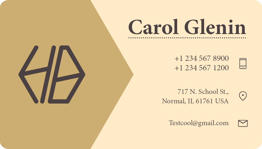
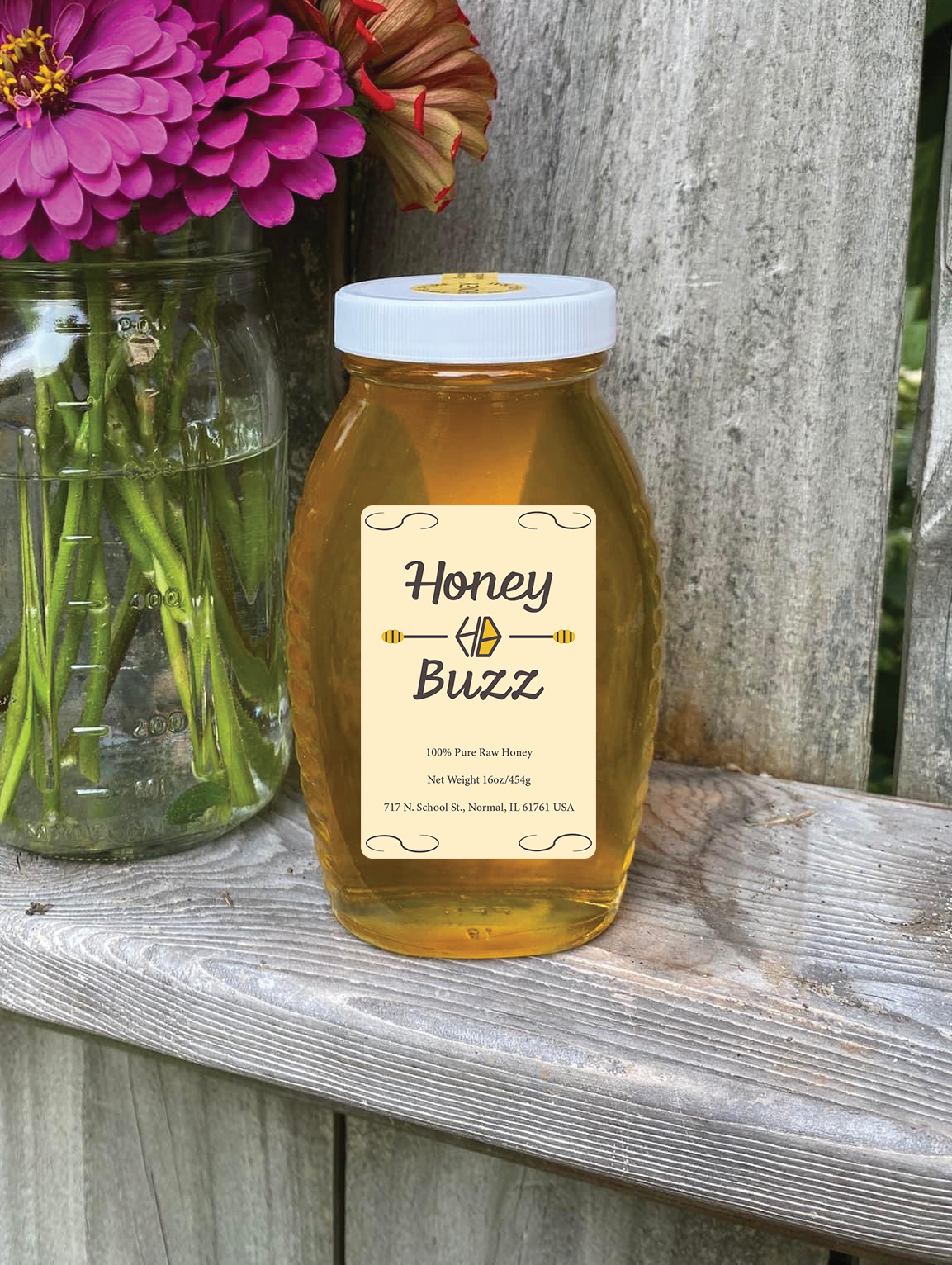
Much like with the label, I converged with the the business card as well. Elements of the logo can be seen on both sides, as well as a serif font to complement
the professional design.
the professional design.
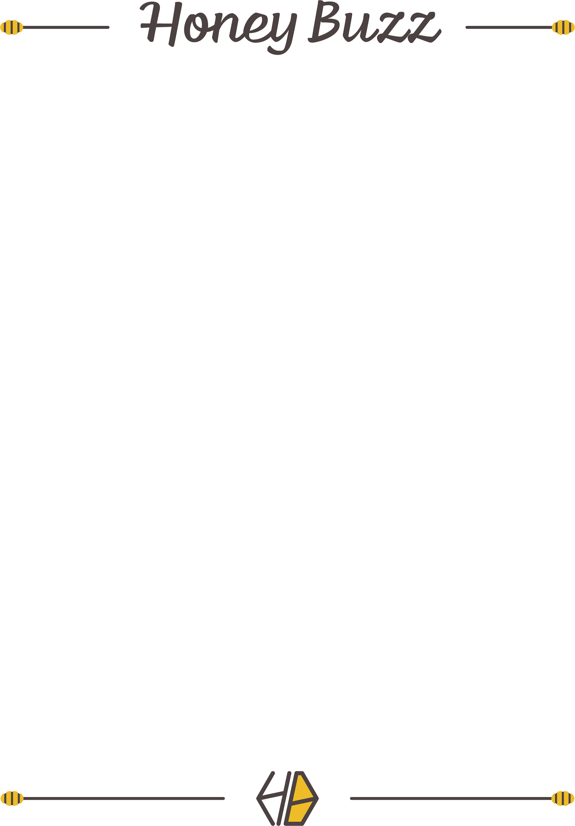
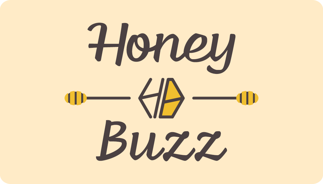
Finally I designed a header and footer for the company.
This would be used for their documents.
This would be used for their documents.